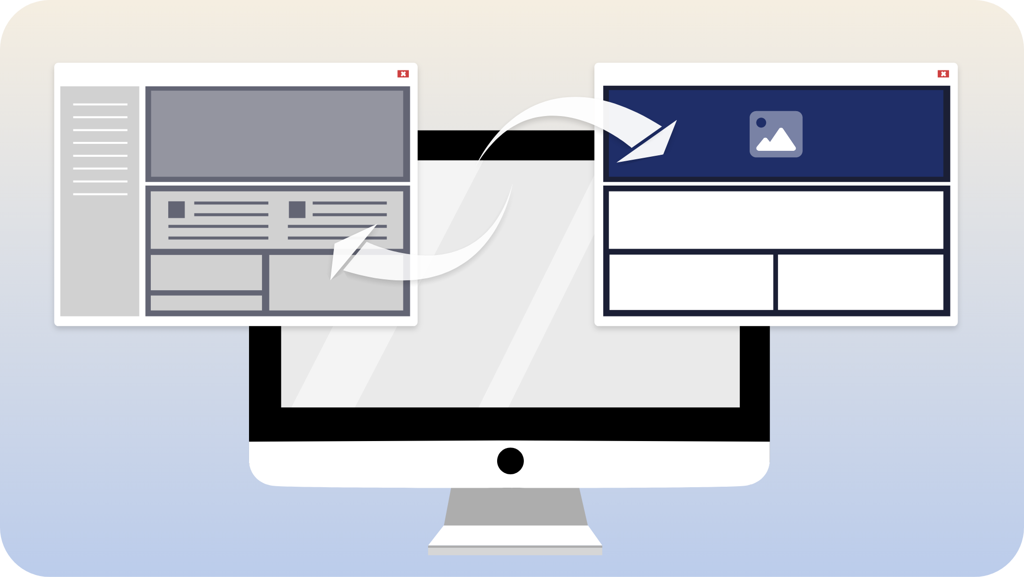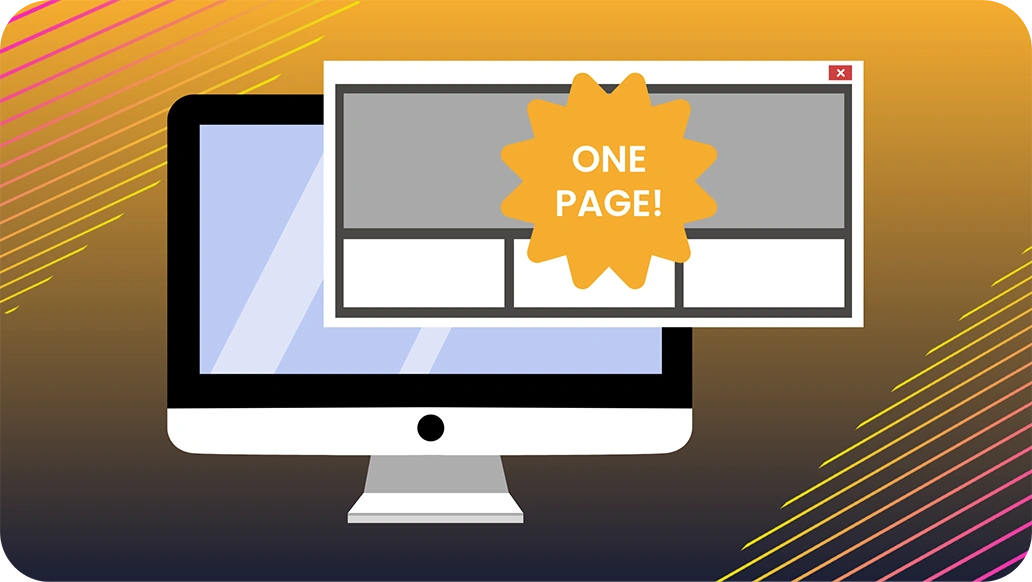
To convert more leads on your website, consider creating a user-oriented experience by limiting your content to one page. Single page websites, also known as landing pages, present information in a labor-saving way that simplifies your conversion funnel. Here’s how…
- Efficient and effective. A single page website can be the most economical way to spend your precious resources, time and money, while increasing conversions. It focuses all of your development resources, content, and attention into a single basket.
- Less errors. Small websites have less room for errors, and with only one page, you’re guaranteed to catch them. One technical issue can ruin the user experience and all other efforts to grow traffic, acquire customers, and increase conversions or retention.
- The Doorway Effect. Ever walk into a room and then forget why? Your brain made space to process the stimuli of your new environment by dropping the thought of why you were originally going there. The same thing happens on a website: you load a new page, but the sudden burst of stimuli pushes the last thought out. A single page website avoids this problem – the user smoothly scrolls the entire content of the site as a single environment. Don’t make users go to a new page with new stimuli and risk losing them- keep them on the conversion path!
- Boost conversion rate. An experiment by Signal v. Noise concluded that single page websites generate 37.5% more conversions than their larger counterparts. Eliminating distractions and rabbit holes with a streamlined landing page means users begin the conversion process sooner and move through it faster.
- Intuitive. Single pages support an intuitive user journey. Users are able to follow a natural, linear navigation flow with a distinguished beginning, middle and end, with no additional pages to navigate. The less that is required of customers when using your website, the more likely they are to have a smooth, positive experience.
- CTAs. Single-page websites are focused on a single goal and are great at calling out actionable items. Easy navigation for users means it’s easy to direct them to a CTA. Zero diversions could result in an increase of conversions.
Takeaways: Focus your efforts on making one small thing amazing, rather than a bunch of stuff that is mediocre; make your business’s website functional and intuitive for visitors.
To see some examples we’ve created of single-page websites, you can view our homepage here, or check out our clients, Apex and Universal Hair Units. If you’d like to learn more about improving your website and digital presence, reach out to us, or discover more in our knowledgebase.
© Melinda O’Connor 2023