
Mobile-first design strategies appeared circa 2013 as a response to rising mobile traffic, enabled by the widespread adoption of the smartphone. With mobile traffic increasing to a staggering 55% of internet users today, it’s stuck around ever since. But there’s a fatal flaw: while mobile traffic has grown, screen sizes have diversified and grown not just smaller, but larger too. Case in point: this article is being written from a 4K monitor.
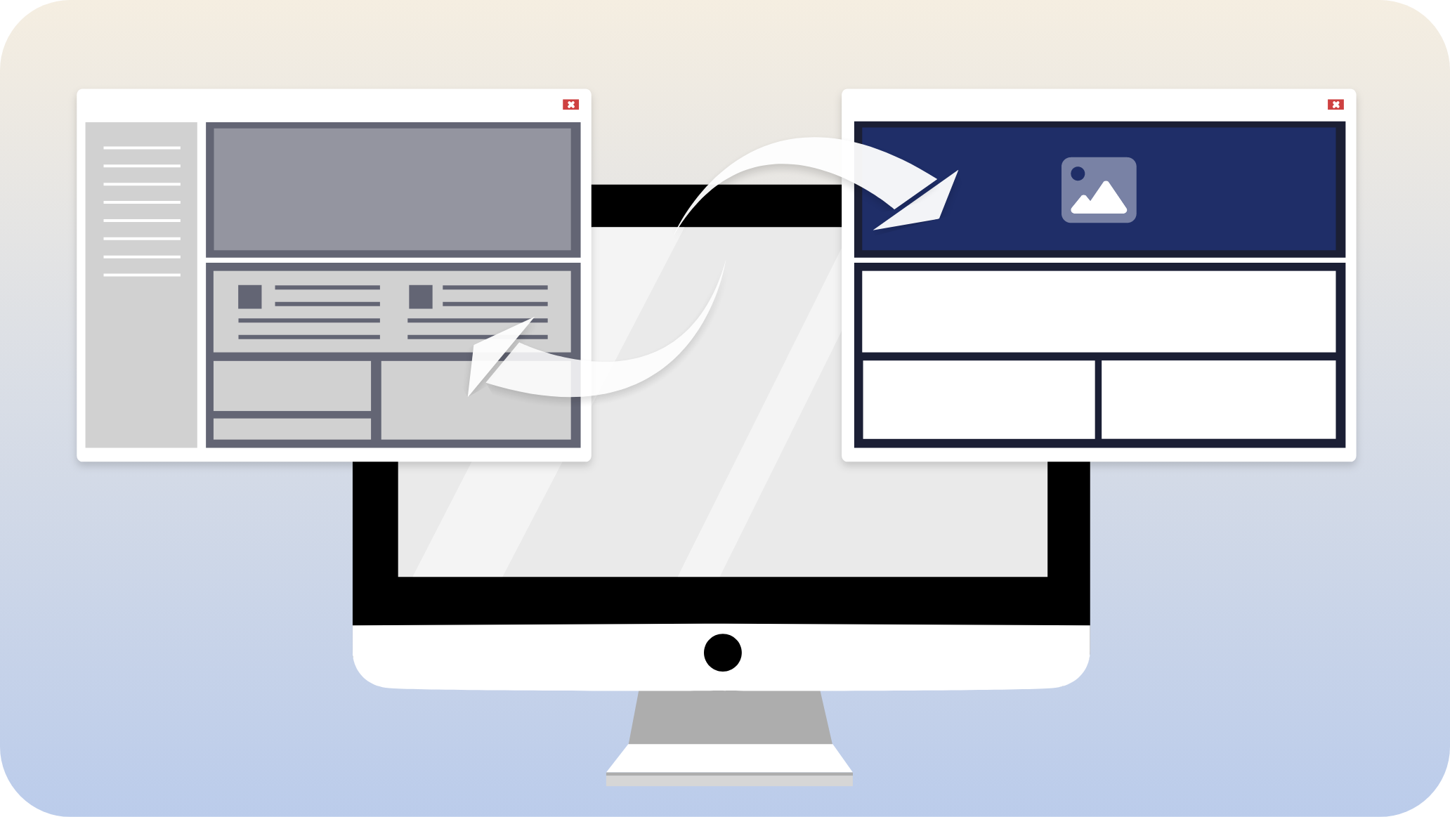
And while mobile-first did a great job of recognizing the importance of the mobile experience, it’s worked against big-screen traffic. This is especially significant because larger screens imply users with more dedicated computing power, more discretionary spending, and more likely to be at work or a serious setting — all desirable attributes for B2B targeted marketing. But, when it comes to design and user experience, it’s much easier to make large things small than it is to make small things large. We can demonstrate this with two pictures:
 This is a big image made smaller.
 This is the same image enlarged by the same ratio.
The same problem happens with mobile-first: the design becomes blocky and effectively pixelated on larger screens, there’s simply not enough content to extrapolate from.
- Images appear larger than intended
- Important details get truncated from banners
- The view port is different than designed for (wider-than-tall, instead of taller-than-wide)
- Content gets spaced out more, focus is often different than intended
- Total viewable content changes, impacting experience
These problems can ultimately be accounted for, but it requires significantly more work and expense than approaching from the right direction: converting a desktop design to mobile. To play the perfect game, the right move is going mobile-second.


