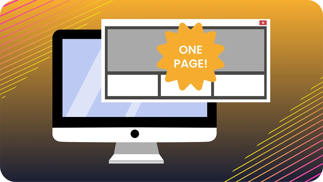
Focus Your Homepage on What Matters. If UX Matters to You.
Have you seen those tickers running across the top of homepages these days? Calling out random things? Not good.
They’re usually shouting about the CEO’s latest message, an obscure company milestone, or some half-baked idea someone decided was “strategic.”
And while these messages may be important to a few people internally, they are often meaningless to the user. Don’t let interruptions distract from the real reason people visit your website:
To understand what you offer and how it helps them.
Let’s be clear. Your website exists to serve your users. Not your executives. Not your board. Not your internal comms team. Your users.
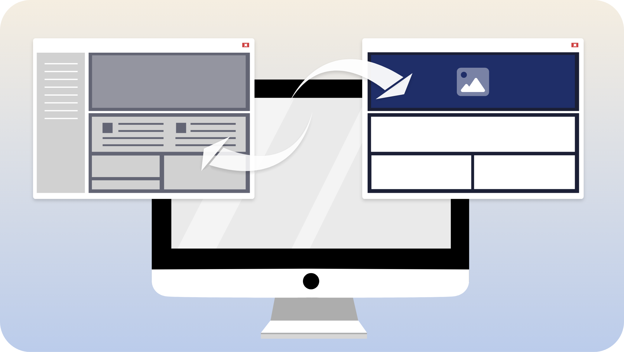
If your homepage isn’t laser-focused on your core products or services, you’re wasting valuable real estate. That opening view, before anyone scrolls, is your first impression. It’s where attention is at its highest. And most companies squander it.
What Should Be on the Homepage?
Your homepage should do three things quickly and clearly:
- Say what you do.
- Say who it’s for.
- Offer a next step.
That’s it.
Not a press release. Not a leadership spotlight. Not an investor update. All of those things can live deeper in the site, where people can seek them out if they care to. But don’t force every visitor to wade through noise to get to what they came for.
When users land on your homepage, they’re trying to solve a problem. They’re asking questions like:
- Does this company do what I’m looking for?
- Can they help me with what I need?
- Do I trust them enough to take the next step?
If your site answers those questions directly and simply, you win. If it buries them under a layer of self-promotion or executive announcements, you lose. Don’t blow it. You only get to make a first impression once.
When Pop-Ups Become a Problem
Let’s talk about pop-ups.
Not all pop-ups are bad. A discount offer for first-time buyers? That’s useful. A reminder to register for an event I’ve already shown interest in? Also useful.
But most pop-ups are irrelevant. They trigger immediately before the visitor has a chance to understand what your site is even about. They block navigation. They create friction. And they often come with a dark pattern close button that’s hard to find or purposely deceptive.
Every interruption you create is a gamble. If it doesn’t align with the user’s intent, you’ve just added frustration. Enough frustration, and the user leaves. Now, that’s a bad customer experience and counter to your customer promise, no doubt. Can any brand afford that?
Want to know how many leads you lost because of a bad pop-up? You’ll never know. Because the people who bounced never got far enough to become a stat in your funnel.
Alert Bars Aren’t Much Better
The same goes for alert bars and banners.
A well-placed banner for an actual, time-sensitive sale? Great.
But if your alert bar says “A message from our CEO on Q1 priorities,” you’ve officially lost the plot. That’s not what your customers are here for. And it’s certainly not what your homepage should be leading with.
If you feel compelled to highlight something, ask yourself: Is this something most users care about? Or is this something someone inside the company cares about?
The two are rarely the same.
Executive Messaging Belongs Elsewhere
You can still showcase your leadership and values, but not in the hero slot.
If your CEO has a message, put it in the About section or a dedicated press room. Link to it from a blog or a newsletter for those who opt in. Don’t plaster it across the homepage.
This doesn’t mean you hide your mission. Quite the opposite. Your mission should be felt in every word and image on your homepage. But it should be embedded in the experience, not spoken at the user like a PowerPoint intro slide.
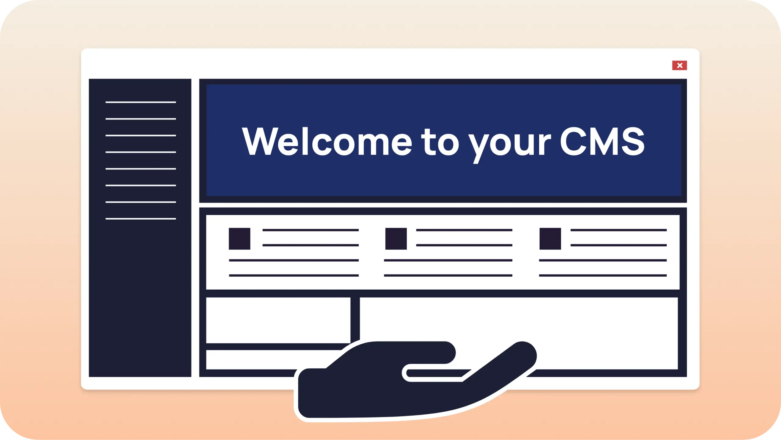
The Homepage should be an Experience, Not a Billboard
Think of your homepage as an introduction at a party. You don’t walk up to someone and start reciting your résumé. You don’t interrupt their conversation to talk about yourself. You listen. You offer something relevant. You connect.
That’s what your homepage should do.
Here’s how to think about the structure:
- Hero message: What’s your main value proposition, your customer promise? Say it clearly. No jargon. No fluff.
- Primary Call-to-Action (CTA): What do you want the user to do? Buy something? Schedule a demo? Start a free trial? Make it obvious.
- Proof points: Show that others trust you. Logos, testimonials, or a short case study.
- Navigation that guides, not overwhelms: Group content logically. Make it easy to find answers.
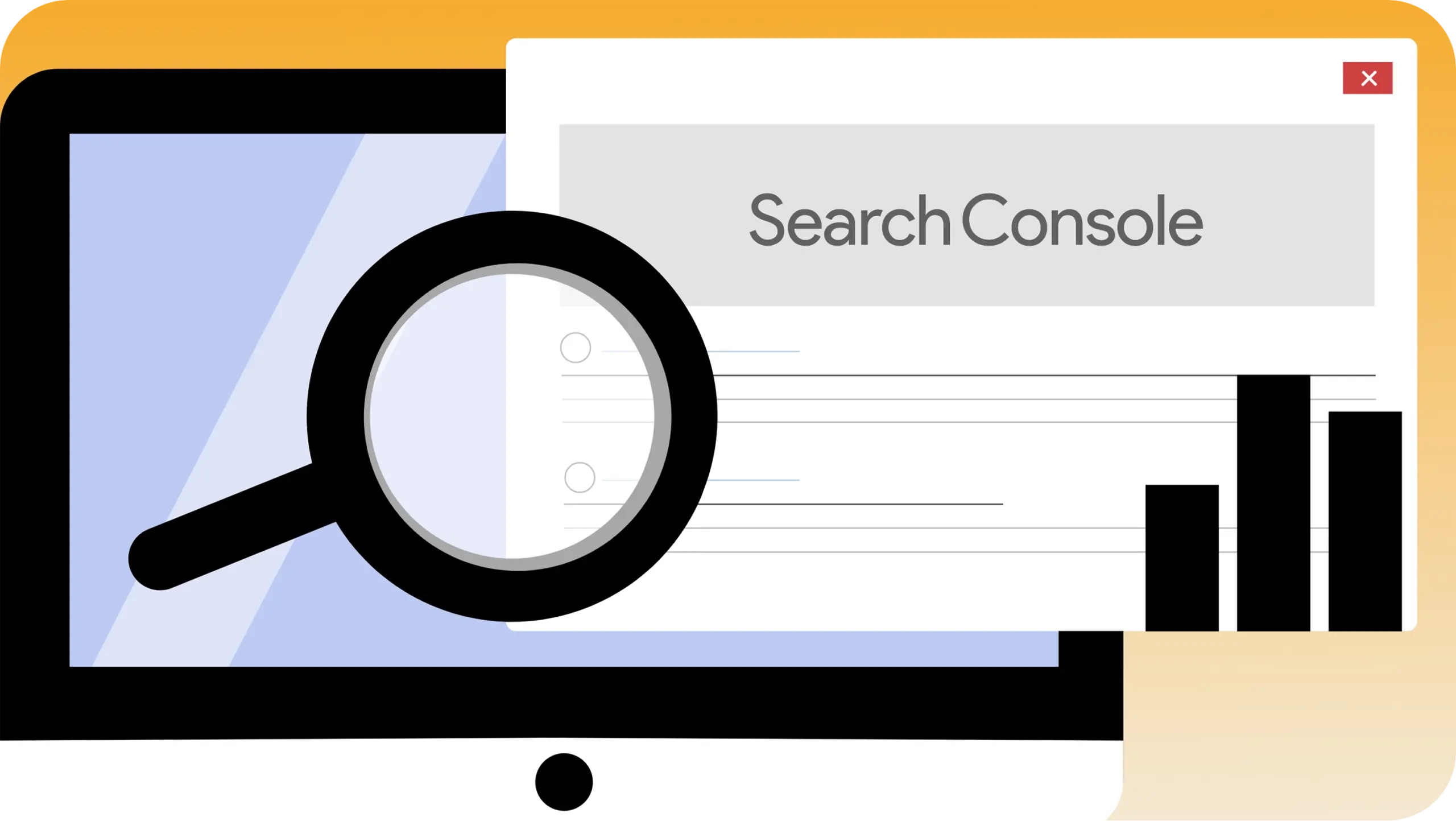
One More Thing: Google Cares Too
Search engines don’t just rank based on keywords. They measure engagement. Bounce rate. Dwell time. Conversion paths. If your homepage is confusing, irrelevant, or cluttered, people leave faster. When people leave fast, your ranking drops.
You don’t just lose the customer in that moment. You become harder to find next time.
Focusing your homepage on what users care about is not just a UX choice. It’s a growth strategy.
Remember Why You Built a Website in the First Place
You didn’t build a website to showcase your internal strategy. You built it to connect with users. To guide them. To convert them.
So cut the clutter. Remove anything that isn’t serving a clear user need. Let every pixel earn its place.
The homepage isn’t your executive summary. It’s your handshake. Make it strong. Make it simple. Make it about them.
Because in the end, the needs of the many outweigh the needs of the few. Build for the many.
Don’t know where to start? Not sure what your customer promise is? Let’s talk about it. Schedule a GoogleMeet with us today at hello@logical-inc.com.