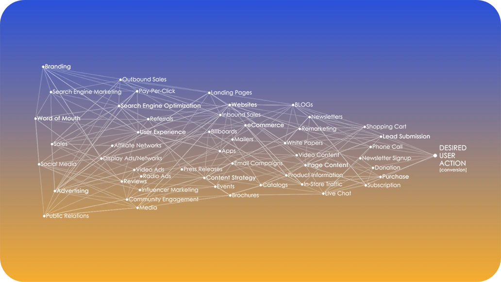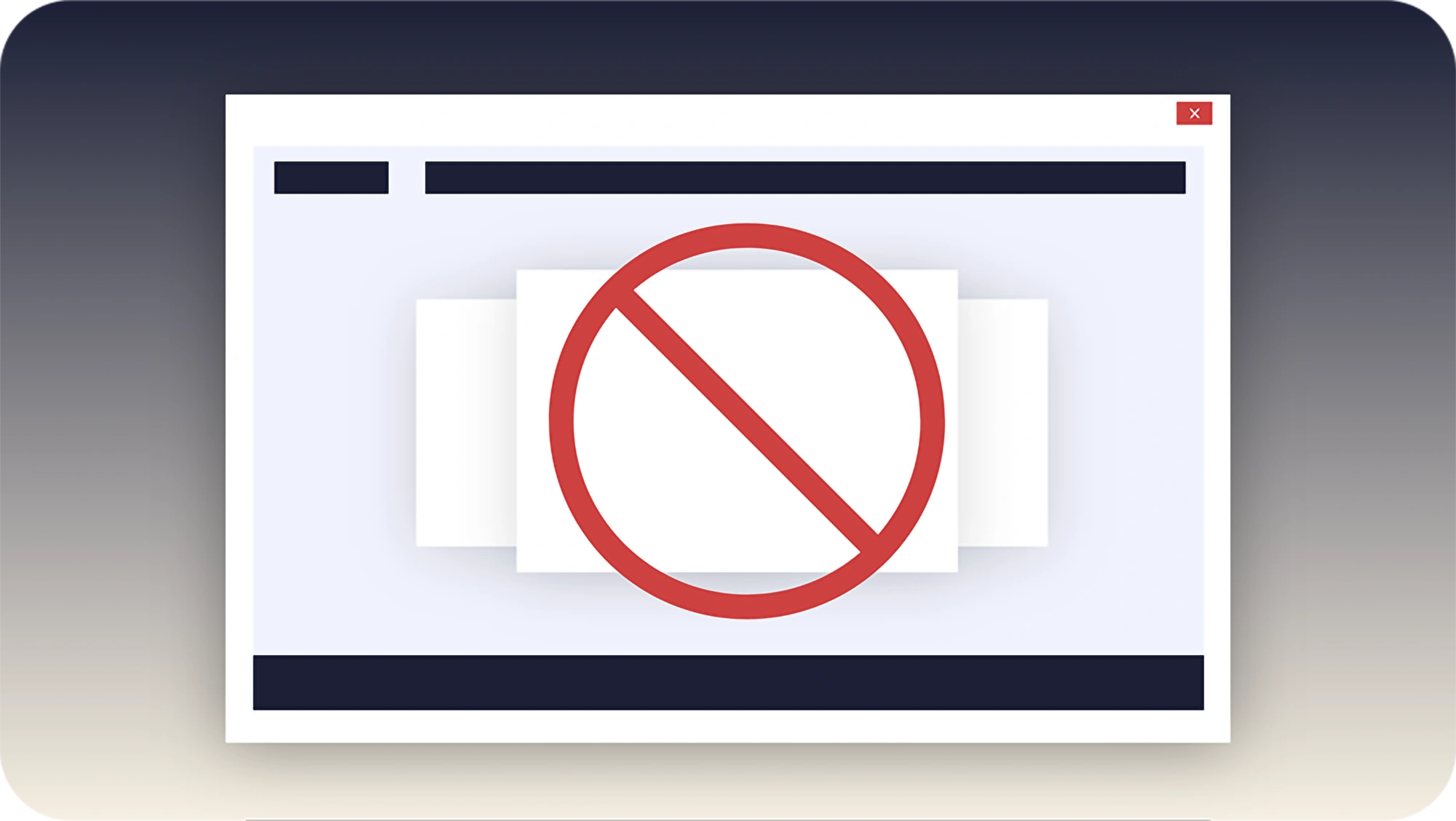
Rotating hero banners were all the rage in 2014. They gave companies a way to pack multiple messages into a single high-value space at the top of a homepage. On paper, the idea seems strategic, smart, insightful: why show one message when you can show four?
In practice, it rarely works.
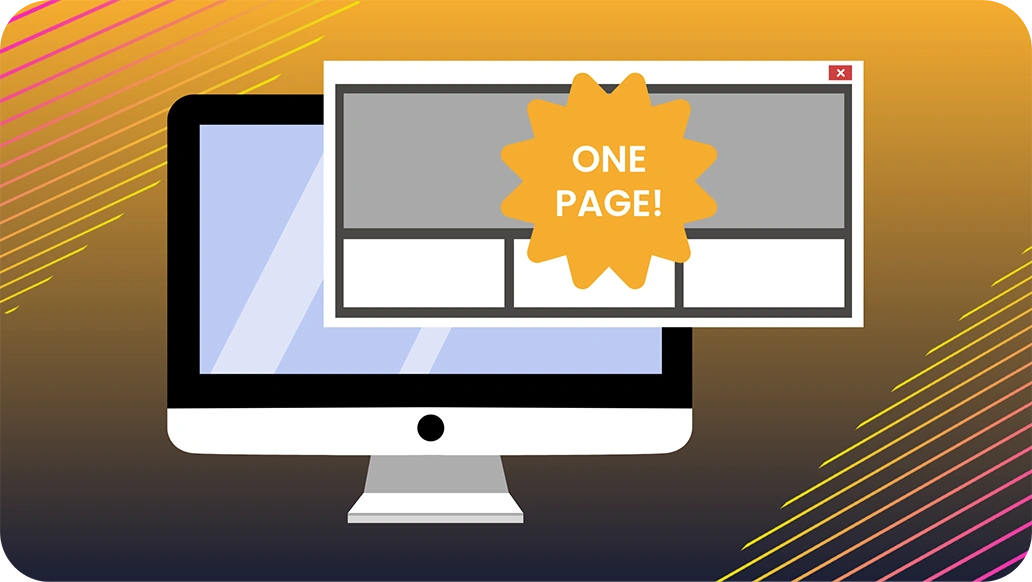
One Thing Can Be BIG.
Most visitors scroll past the hero almost immediately. They see the first message of the banner, if any, and the rest go unnoticed. Even when someone tries to engage, the banner often rotates before they can finish reading. The typical transition time of three to five seconds is too short to absorb a message and too long to feel deliberate. But, just right to frustrate and annoy somebody.
Don’t Blink. You’ll Miss It.
What happens if the user isn’t looking at the screen when the page loads? Unfortunately, several banner messages may have already rotated by. In fact, you no longer know what a visitor has seen, which breaks content continuity and weakens downstream messaging. It also introduces
noise into A/B testing and performance tracking. You can’t optimize what you can’t reliably measure.
Pages get heavy, fast, and slow down everything.
Rotating banners come with technical baggage, too. They increase page weight and slow load times. Google doesn’t like that, and you shouldn’t either. Why? Because one of the factors Google uses to rank your website depends on load speed. Do you really want to mess with that?
Plus, from an accessibility standpoint, rotating banners can create issues for people with cognitive or visual sensitivities. Gives a whole new meaning to, “wow, you’re giving me a headache.” Not a good brand experience.
Stop Preventable, Bad Customer Experiences.
With everything you do, remember your brand and customer promise. You can be pretty sure that promise is not, “let’s confuse and frustrate” people.
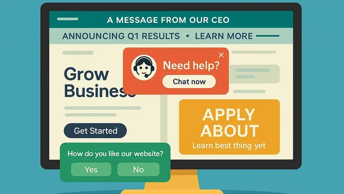
When each banner message pushes a different idea, the site feels unfocused. Instead of driving clarity, the carousel creates confusion. Visitors are left wondering what matters most and what action to take.
Don’t let rotating banners distract or annoy your visitors. That’s never good for any company brand. Do the right thing.
Say one thing. Say it well.
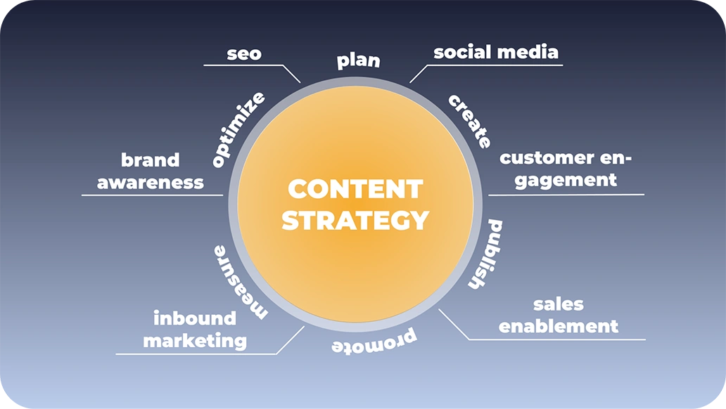
A single, clear message supported by a strong visual consistently outperforms a rotating set of competing headlines. If you need to highlight multiple types of content such as blog posts, product updates, or case studies, use cleaner, more effective design patterns. Scrollable cards, featured sections, or tabs can deliver the same utility without sacrificing usability.
Make a great first impression.
Your hero banner is your first impression. It’s the first introduction of who you are to a user. That space should clearly state what you do best and what defines you as a company. The more permanent and consistent that message is, the better it performs for Google and search visibility too.
Rotating hero banners are outdated, ineffective, and misaligned with how people actually use websites. It’s time to leave them behind. Are you ready to say goodbye?
Let’s bring your website up to date
Schedule a quick Google Meet with our team and let’s talk about how to make your website more focused, faster, and far more effective.